Posts

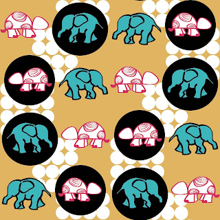
Upholestry Fabric possibilities

Image
Upholestry fabric tend to have some very interesting prints that one cannot resist the urge to not buy. Thats true for me, its not like I need the fabric for new curtains or re-upholster my sofas its just that some designs are just so unique that one gets drawn to them. Well, atleast I do, so I ended up buying a yardages of a few of my favorite prints out of the lot I was looking through in the shop. I kept them in my studio for a few months, looking through them now and then to get inspiration to put them in use, then it hit me, Pouches and bags of course! standard travel size products. The best thing about the upholestry fabrics is that they are thick, washable, not easily torn or damaged, the weave thickness cushions the items placed inside to prevent damage, perfect to put jewelry or make up in. Here are some of the pouches and zipper bags that I came up with.  

Clamp-dye tecnique on silk scarves

Image
Clamp dying is perhaps as ancient a technique as indigo dying and batik work would be. Clamp essentially is a technique where you fold a piece of cloth in as many folds as you want and then tie/sandwich the cloth between clamps of your choice.These Clamps could be sticks, wooden blocks, coins etc anything really, let your imagination run wild. How you fold the fabric, which,in this case is silk scarves, deduces the final dyed pattern on the silk after dying. You can fold the scarf in to a small /large square, rectangle, triangle or just random bunched up form tied with a thread (jute, or any yarn) between two clamps tightly and then immerse it in to a prepared dye bath. Silk can be both hot and cold dyed, depending on the dyes you are using. I did cold dyeing. Anyways, if you have done clamp dying as many a times I have, you would want to explore options of clamps (I always try to find things that are available at home) it just makes things more easy and the...

Colorways and their effect on a print

Image
In my last post I had worked made a stylized animal print in various repeats. To further the same design, I decided to make its color ways to explain the effect just a few colors to a design can do and the impact it has on the entire design, to an extent that it may as well change the consumers and the product range itself. It may elevate a design or make it look completely common. Ice always been told that a color can make or break a design, and I have grown to be a firm believer in that. Here are the worked color ways of the previous design in straight, mirror and half drop repeat format. Half Drop repeat: Mirror repeat:          Straight repeat: 

Print Design for the kids

Image
Designing for kids or creating prints catering to that particular area has always been a challenge for me. Doodling or complicated damask, pen and  inks are my comfort zone. I actually do not have to think on those subjects, but to create a format or motif for kids takes me months to come up with. I still have not  figured out why so, but I would like to blame  it on the "designers have their own niche syndrome"  which brings me back to my post as to why I decided to indulge in the area that forces me to "brain storm" at the first place. As a mother, when I sit with my girls to draw with them, sometimes they would ask me "mamma make me drawing of a dog or cat etc. and like all parents I oblige, the drawings are rarely accurate (we all aren't natural Da Vinci's here) but the caricatures or flat two dimensional images made my kids happy, they would color it , keep it, collect it. What intrigued me the most was that the children recogniz...

connecting art continues

Image
This post entry is a continuation of the floral acrylic connecting art paintings that I had written about earlier on in my blog. This two piece connecting art canvas has large flowers which I have converted in to a mirrored repeat pattern and then mapped it on to home furnishing and home goods products. I have also done two color ways of the same design, mapped on to products with the same background color(off white) to avoid too much color distraction and appreciate the design in its full capacity. This is what I have come up with. Initial design converted from acrylic on canvas series       I decided to create a baroque look to this design, it gave me a Victorian feeling once I was done with  color combinations for this particular design pattern. I chose to go with a continuous design pattern. This is what income up with.           The design seemed to me, perfect for wall paper but I decided to ...

The conversion channels and print mapped

Image
  This is a continuation to the connecting floral art post that I had written earlier on, the first design was the flowers in blue entwined and how I drew the entire print design from canvas on photoshop, in to a repeat pattern, then treated the design to create two versions and finally mapped it on to two vastly different products available in the market for consumers.  The reason for this particular post is to be able to give a visual to those who want to understand the  many faces and possibilities of a simple design and what can emerge through it, also how and design which started as a simple drawing of pen and ink is rendered and treated for different products respectively. As a designer one needs to understand how a design needs to be worked out for different products. I have mapped the same print with variation and color ways on to two very extreme products. Following are the images, from the beginning to the eventual mappings.     ...

Floral connecting art

Image
The acrylic and pen designs are my favorite passing time,a hobby, a way to relax my mind while I think about what to work on my next collection of  print designs or jewelry pieces.Its my method of venting out so to speak.  Most of my designs usually are floral with spirals, over the years that kind designs and prints have become my "signature" something that comes easily to me without even thinking about how and where I would place a certain motif while starting the print on any surface or working on photoshop. I assume that each designer would have a preference of certain kind of motifs and designs that becomes their strength or their "niche", a preference, a signature of theirs which defines them as a particular kind of print designer they are, which could range from children's patterns, lines, stripes, foliage, shapes, seasonal etc. to be honest an artist is an interesting enigma of its own. Here is some of my floral connecting art on canvas. My favorite dood...