Posts

luggage_carry on's as accessories
Image
Long gone are the days when carry on bags were simply a bag of smaller size to pack basic necessary items to facilitate quick/business etc traveling, now a days carry ins have become more then a necessity for a hassle free traveling, the type of luggage and carry ins no longer are restricted to solid basic colors with only hard covers, now a days they are coming in various standard sizes, colors, prints, shapes and fabric constructed. The reason being that it has become more of a fashion statement too, because the type of color, print and size one chooses determines their personality in one way or the other. Personal choice precedes just picking out any you see instantly in a mall etc. Now, people take their time to buy what suits one's taste and over the years many companies have invested to provide consumers what they prefer. In this post I mapped one of my Damask designs with two color ways on to the carry on luggage with various sizes. This is what I came up with. ...

kaleidoscopic design and mapping

Image
The images created  within a kaleidoscope have a mesmerizing effect on the person looking within. The designs are unusual, creating mirror images of objects and playing with ones imagination. In this post I will be adding a design inspired by kaleidoscope patterns in a straight repeat. I minimized the colors to three and kept all the color ways in a monotone and complementary colors and avoided high contrasts so that one can easily appreciate the complexity of the design pattern without getting distracted by the high color contrasts. I further mapped the designs on flat bed mapping to give an illustrated idea of how the design might look if converted for bed linen.  

Colorways

Image
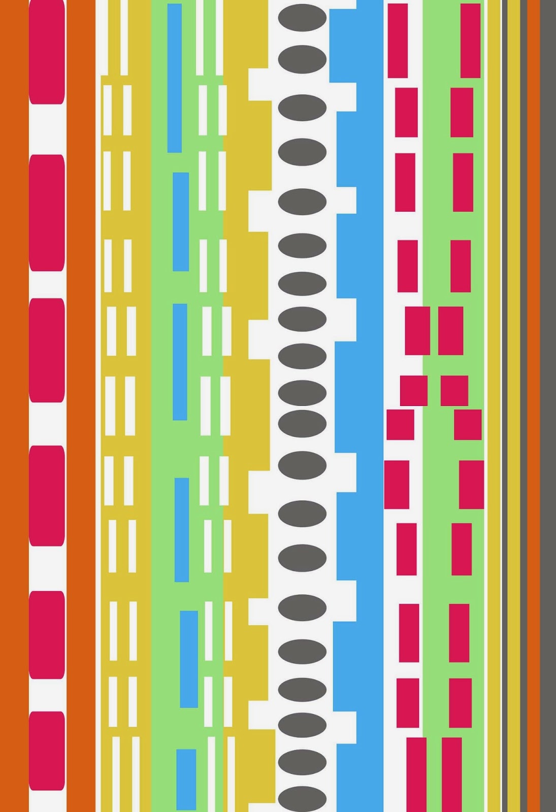
Usually when we create a design, as designers we are usually expected to create each designs several color ways to give options to consumers. Sometimes a design may end up looking much more in depth in a color ways then the initial color design created, we call it the "Main Design"  In this post I will be adding the same geometric design that I had mapped on products in my last post with color ways and mappings on a dress to give a visual.  

one Design for all

Image
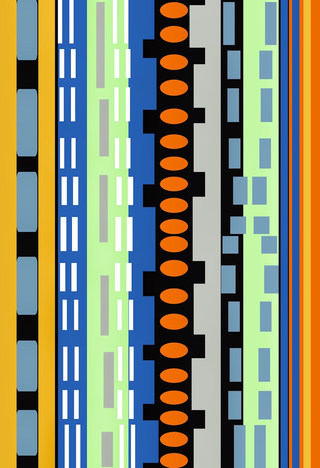
In my last post I had mentioned that any design needs to be tapered to a specific surface to be printed upon. In order to get a visual understanding of how the design might end up looking we create mappings to get a visual before the actual product at hand. In this post I will try to explain my point by using a geometric design and how we change the design's size and dimensions according to each surface that we map it on. I tried to keep the mapped surfaces as different as possible to be able to illustrate my point. I chose a Sofa, Bed flat mapped and a long dress on a mannequin to map this geometric design on. This is how it came out to be. You can see how the design in the dress is smaller in size compared to the ones mapped for upholstery. It could be reversed depending on the taste but generally designs on apparel tend to be smaller.  

Designs when mapped

Image
Often on it becomes difficult for consumers to visualize how a design may end up looking on a product, not because of the lack of imagination ,but simply because each design needs to be "tapered" to a particular product that needs to be printed on. Such as, how big should a print or design look on a certain product? like say a mug, bedding or curtains etc. How many times should each motif or pattern would be repeated on a desired surface of the product? that and so many other questions a designer is usually deciding while mapping and trying to make appropriate changes as required. In my last post I had talked about some Damask designs and their layering. I will be using these very designs to illustrate my point regarding designs mapped and the complete look it gives one to understand the beauty and many possibilities of a design. Mapping helps one to get a perspective a " feel" to any design. Some may end up looking unappealing on one surface and look absolutely...

layered design patterns

Image
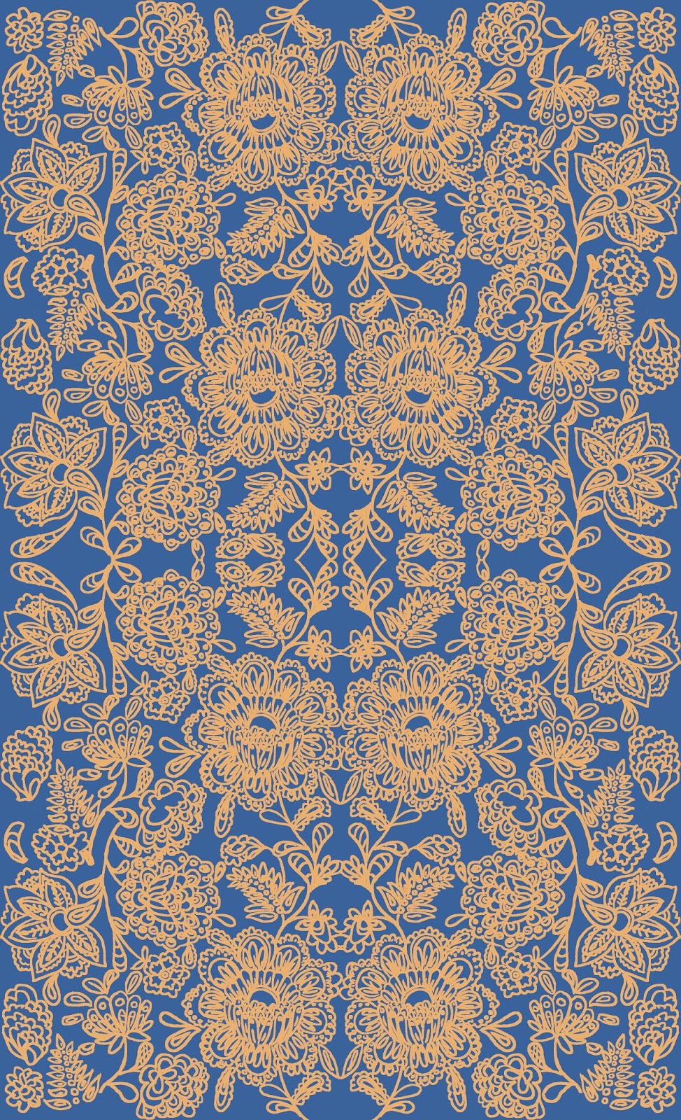
Damasks or floral motifs are usually placed either on a plain background or are so intricately made that the background sometimes seems to get "dissolved" so to speak in the entire print. I have rarely seen arabesque  or floral banquet designs with geometric designs patterns running in the background or layer on layer of the same print motifs, perhaps it is avoided because one wants to see the intricacies in its full glory or perhaps the concept "less is more" is readily followed while creating a design. This subject obviously piqued my interest and I took on to my self  to merge and create designs with bus backgrounds to make the design seem to have more depth with an interesting background to floral prints. Here are two designs depicting such an idea.  

glimpse of some freelance work with Keka Case

Image
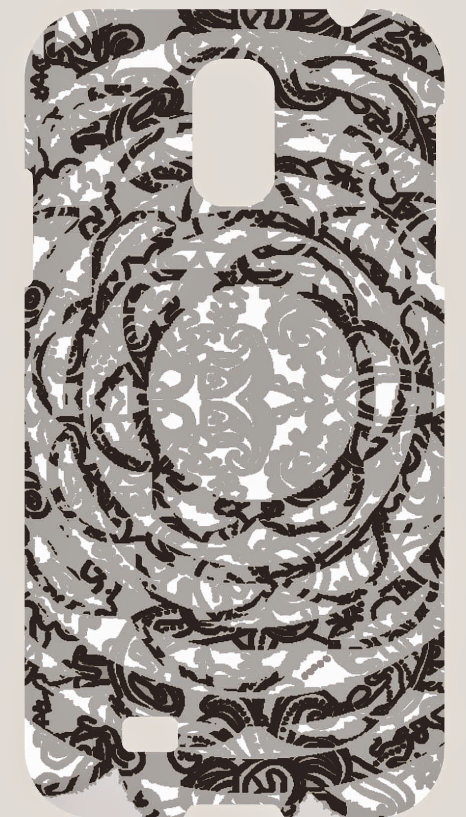
As a freelancer, I also worked with Keka case (solid line case) and made designs for their wide range of products from home décors to cell phone and tablet covers. Here is a glimpse of some of my designs mapped on the products. You can contact directly to Kea case solid lines if interested in any designs you see here.(Keka Case reserves the rights on these designs so reproduction of these designs are prohibited) products. The images are of low quality intentionally and only a few mapped designs are being posted just to give you the general idea of the designs I worked for Keka solid line product. Hope you enjoy them. Feedbacks are always welcome. Keka solid line products designs have their own website and are also on Facebook under the name of Kea Case check them out. :)